G2 Market Intelligence empowers you to make smarter go-to-market decisions by leveraging G2 review data to generate real-time insights about your customers, competitors, and market trends.

Once G2 Market Intelligence has surfaced a trend, you can directly segment, refine and export both the corresponding chart data and the underlying G2 review data for deeper analysis.

Already familiar with the basics of Market Intelligence, including filtering and exporting your data? Select one of the following links to skip to tab-specific documentation.
Basics of Market Intelligence
Market Intelligence groups insights from G2 reviews into four tabs:
- Traffic Analytics leverages category traffic data and G2 Buyer Intent comparison signals to reveal patterns in buyer activity across your product's G2 categories.
- Satisfaction amplifies the voice of your customers by analyzing several measures of satisfaction from your G2 reviews alongside the same data for your competitors.
- Win Loss highlights trends in customer churn to place your feedback in the context of your competitive landscape.
- Pricing and Contracting reveals how customers feel about your product’s price point, and helps you understand how your competitors discount and sell their products.
- Category Overview enables you to identify industry trends and contextualize your findings from the individual Traffic Analytics, Satisfaction, Win Loss, and Pricing and Contracting pages by generating category-level insights from a broader selection of products.
Data sources
The data for each Market Intelligence graph is sourced from a specific question on the G2 review form. For more information, refer to the Data sources table in the Satisfaction, Win Loss, and Pricing and Contracting sections.
Category Overview uses the same data sources as the individual Satisfaction, Win Loss, and Pricing and Contracting pages, but analyzes data from all products in your category with at least 10 G2 reviews.
Filtering Market Intelligence data
Each Market Intelligence tab contains a filter panel to help you segment and refine the G2 reviews included in your dataset.
By default, G2 displays Market Intelligence data for the past six months. To adjust your time interval, select one of the default options.

The Satisfaction and Pricing and Contracting tabs enable you to switch between quarterly and monthly time scales.

G2 also offers the following firmographic filters to help you refine review data:
- Company Size: Filter by reviewers from small business, mid-market, or enterprise companies.
- Industry: Filter by reviewers from a specific industry.
- Category: Filter by reviews left for a specific product category.
- Region: Filter by reviewers from a specific global region.
Firmographic filters are automatically populated based on your time interval and the products included in your dataset.

Firmographic filters are dynamic – selecting an option in one firmographic filter can affect the options available in another filter.

Exporting Market Intelligence data
At any time, you can export your chart data and the corresponding review response data directly to a spreadsheet by selecting Download from the filter panel.

Select the checkbox for each chart you want to include, then choose a Format for your export. You can export your data to an XLSX file by selecting Excel, or to Google Sheets by selecting Sheets.

If you select Sheets, you will be prompted to log in to your Google account.
Your export contains a sheet containing the data for each chart you included in your export, as well as a sheet containing all the G2 reviews that meet your filter criteria.

Chart data
Exporting your chart data enables you to use your Market Intelligence data to generate your own visualizations, create battle cards, and supplement your existing success metrics.
Working with raw G2 data outside of standard reports? G2 Technical Consulting helps teams design and implement custom data workflows using G2 marketing intelligence data.
Contact G2 Technical Consulting
Each row represents a single data point from the corresponding graph.

Review data
Exporting G2 review data leverages the voice of both your customers and your competitor’s customers to reveal the factors contributing to Market Intelligence trends.
Each row represents one of the G2 reviews used to create the graph(s) included in your export and includes both review and reviewer metadata.

Market Intelligence Dashboard
Market Intelligence Dashboard provides high-level insights from your Market Intelligence data, enabling you to monitor market activity and competitor performance while highlighting areas to explore further using G2 data on Satisfaction, Traffic Analytics, and Win Loss.

By default, G2 populates the Competitors dropdown with the top five products in your main category. You can modify your list of competitors to include any product in a shared category.

To access Market Intelligence Dashboard, go to my.G2, then navigate to Market Intelligence.
Satisfaction
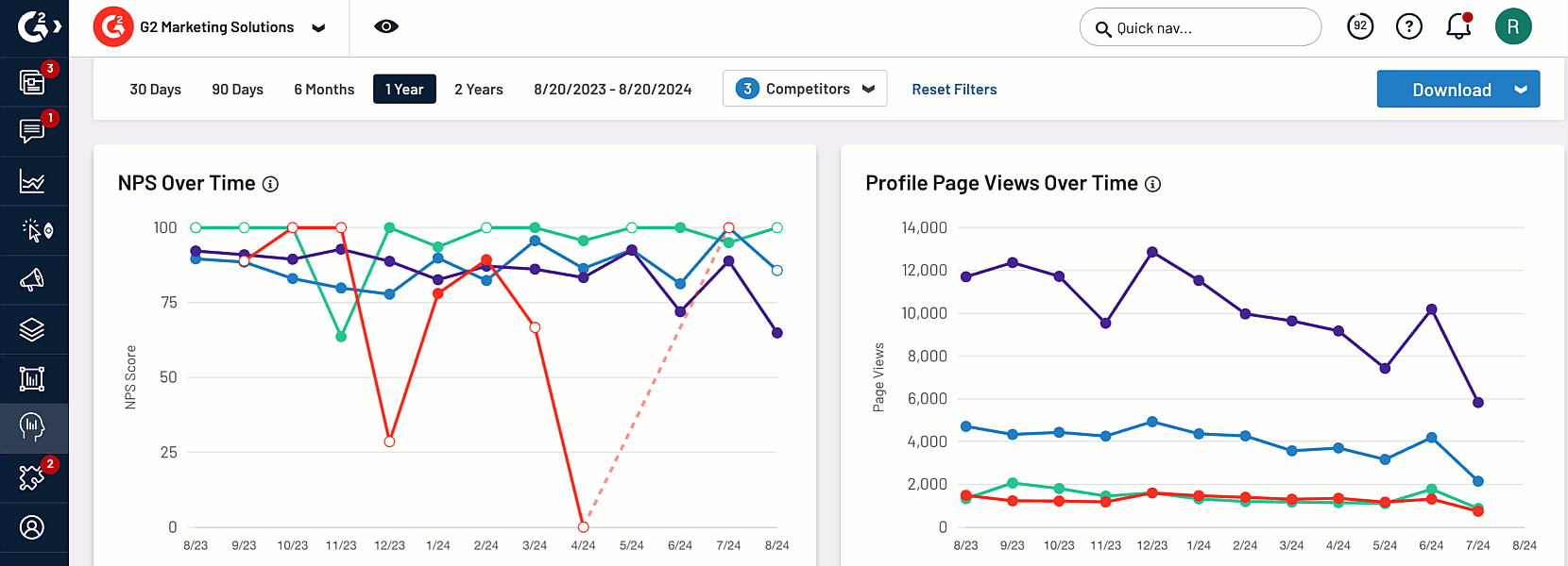
The NPS Over Time chart enables you to understand overall sentiment for your product and your competitors for a chosen time interval.
.png?raw=true)
Hover over a date on the horizontal axis to preview the corresponding chart data, including the average value and the total number of responses, for each product.
The Product Likes Mentioned in Reviews graph provides common themes from free-response fields on the G2 review form, enabling you to understand what users like and dislike about your product and competitors.
.png?raw=true)
Hover over a bar to preview detailed theme data for a product, including the percent of reviews that mentioned the theme and the associated number of reviews.

You can switch between likes and dislikes by selecting the corresponding tabs.

For more information on how this data is collected and reported, refer to the Data sources: Satisfactio section.
Traffic Analytics
The Profile Page Views Over Time chart shows trends in profile traffic over your selected interval. Hover over an interval on the horizontal axis to access the corresponding pageviews for each category.

Win Loss
The Products Replacing You and Products You Replace graphs enable you to analyze changes to your market share over time. You can hover over a bar to preview the corresponding chart data, including the percent of total responses, and the total number of responses.

The Comparisons Made to Your Product graph displays your product's top 5 competitors based on Buyer Intent comparison signals, as well as the corresponding firmographic information for your buyers.

The information in the Products Replacing You, Products You Replace, and Comparisons Made to Your Product graphs are not subject to your Competitor filter selections.
For more information on how this data is collected and reported, refer to the Data sources: Win Loss section.
Category Overview
Category Overview provides category-level insights from your Market Intelligence data, enabling you to identify industry trends and contextualize your findings from the Satisfaction, Win Loss, and Pricing and Contracting pages.

To access Category Overview, go to my.G2, then navigate to Market Intelligence > Category Overview.
By default, Category Overview displays data for your product's main G2 category. To switch categories, use the corresponding dropdown from the filter panel.

Products must have at least 10 G2 reviews in the corresponding category to be included in Category Overview analytics.
Category Overview Summary
The Category Overview Summary panel uses AI-generated insights to help you quickly understand Category data across your competitive landscape, including switching trends and how your product’s Net Promoter Score (NPS) stacks up against competitors within the selected category.
.png?raw=true)
G2 dynamically creates unique, natural-language summaries from reviews matching your selected date range, competitors, and other filter criteria. AI-generated insights are refreshed daily.
You should use AI-generated insights as a starting point for deeper analysis of Category Overview chart data.
Satisfaction
The Satisfaction panel transforms each chart on the Satisfaction page to show the distribution of scores across your category.
For more information on how this data is collected and reported, refer to the Data sources: Satisfaction section.
The scale for each chart is normalized against the highest and lowest values for your category, and your competitors are grouped into four quartiles.

Hover over the name of a competitor to reveal the associated values and review volume.

Within each quartile, G2 displays the top eight competitors by review volume. To reveal the remaining competitors, hover over the and {n} others text.

Win Loss
The Products Being Switched To and Products Being Switched From panels display the products that are gaining and losing marketshare in your category.

Each segment of the pie chart represents a competitor, and is labeled with the corresponding percent of responses. Hover over a percentage to show the name of the competitor and the total number of responses.

For more information on how this data is collected and reported, refer to the Data sources: Win Loss section.
Similar to Switching Themes on the Win Loss page, G2 analyzes review responses to aggregate the top three reasons for churn in your category.

For each chart, G2 also reports churn data for your product, including the top three competitors that users switch to or from, and the top three reasons for switching.

Pricing and Contracting
The Pricing and Contracting panel shows the distribution of pricing scores across your category, as well as the average discount and contract length.

For more information on how this data is collected and reported, refer to the Data sources: Pricing and Contracting section.
The Perceived Cost chart is divided into seven tiers. Hover over the name of a product to reveal the associated value and review volume.

G2 represents the category average using a vertical dashed line. To display the average value, hover over the category average.

Traffic Analytics
Traffic Analytics leverages category traffic data and G2 Buyer Intent comparison signals to reveal patterns in buyer activity across your product's G2 categories.

For more information on Buyer Intent signals, refer to the Buyer Intent documentation.
To access Traffic Analytics, go to my.G2, then navigate to Market Intelligence > Traffic Analytics.
Get started with Traffic Analytics
The Trends Summary panel includes high-level information about your product's G2 traffic, including category analytics and firmographic details about your buyers.

The primary viewer firmographic details are derived from Buyer Intent comparison signals.
The Comparison Page Views panel lists the top 10 competitors by comparison pageview traffic and the firmographic details about the buyers making the comparisons.

The Total Comparisons column includes any comparison made to the competitor product, and not just comparisons between the competitor product and your product.
To access detailed trend analytics for your product, select See More to access the Category Details and Comparison Details panels.

You can also access detailed trends for a competitor product from the Comparison Page Views panel. Only categories that your product shares with the competitor are displayed.

Traffic Analytics Summary
The Traffic Analytics Summary panel uses AI-generated insights to provide a high-level overview of traffic trends, highlighting products and categories with the most page views during the selected timeframe.

G2 dynamically creates unique, natural-language summaries from reviews matching your selected date range, competitors, and other filter criteria. AI-generated insights are refreshed daily.
You should use AI-generated insights as a starting point for deeper analysis of Traffic Analytics data.
Category details
The Category Details panel shows comprehensive traffic analytics for up to five of your product's G2 categories.
You can use the Category dropdown to modify the categories reported in this panel.

The Total Page Views by Category Over Time chart shows trends in category traffic over your selected interval. Hover over an interval on the horizontal axis to access the corresponding pageviews for each category.

The Total Page Views by Category table puts your product's G2 performance in the context of your category traffic by highlighting your rank and awards, such as G2 Badges, in each category.

Select Visit Report Library for a category to access a filtered view of your G2 Market Reports.

For more information, refer to the Report Library documentation.
Comparison details
The Comparison Details panel includes Buyer Intent comparison data and firmographic analytics for your buyers. Similar to the Total Page Views by Category Over Time chart, the Comparison Page Views Over Time chart shows trends in buyer activity over your selected interval.

The Most Compared Within Category table places your product's G2 performance in the context of buyer comparisons.

G2 also reports firmographic information about buyers comparing your product to a competitor, including distributions by country, global region, employee count, and industry.

Satisfaction
Satisfaction analyzes ten measures of customer sentiment to highlight your product’s strengths and weaknesses, and enable you to identify opportunities to outshine competitors.

To access Satisfaction, go to my.G2, then navigate to Market Intelligence > Satisfaction.
The data for each Satisfaction graph corresponds to a specific question on the G2 review form. For more information on how this data is collected and reported, refer to the Data Sources section.
To get started, search for and select up to five of your competitors using the Competitors dropdown.

By default, G2 populates the Competitors dropdown with the top five products in your main category. You can modify your list of competitors to include any product in a shared product category.
Satisfaction at a Glance
The Satisfaction at a Glance panel uses AI-generated insights to help you quickly understand Satisfaction data across your competitive landscape, including where your product succeeds and areas for improvement.

G2 dynamically creates unique, natural-language summaries from reviews matching your selected date range, competitors, and other filter criteria. AI-generated insights are refreshed daily.
Satisfaction at a Glance is currently in beta. You should use AI-generated insights as a starting point for deeper analysis of Satisfaction chart data.
Likes and Dislikes
Likes and Dislikes uses machine learning to extract common themes from free-response fields on the G2 review form, enabling you to identify opportunities for your product roadmap and learn how to best position your product against competitors.

For more information on how this data is collected and reported, refer to the Data Sources section.
By default, G2 selects your top five themes for comparison. To modify the list of themes, search for and select themes from the Themes dropdown.

Select a theme to access the corresponding review data for your product and a competitor, including total reviews, percentage of reviews mentioning the theme, and review quotes.

You can access the full response for a review by selecting the New tab icon.

To compare reviews against a different competitor, use the dropdown in the Product Users’ Likes and Dislikes panel.

To modify the list of competitors available for comparison, search for and select different competitors from the Competitors dropdown in the filter panel.

To switch between likes and dislikes, select the corresponding tab.

Feature ratings
Feature Ratings uses review data to provide insight into user perception of feature value, enabling you to understand your highest and lowest rated features compared to your competitors.

The Feature Ratings panel includes the highest and lowest rated features for your product alongside a competitor and the total review response count for each feature.

To compare ratings against a different competitor, use the dropdown in the Feature Ratings panel.

To modify the list of competitors available for comparison, search for and select different competitors from the Competitors dropdown in the filter panel.

You can switch between top rated and lowest rated features by selecting the corresponding tabs.

The Unique Features panel highlights category specific features shared between your product and your competitors.

You must select features for each of your product’s G2 categories for the Unique Features panel to populate. For more information about managing your features, refer to the Features tab documentation.
.png?raw=true)
For more information on filtering and exporting your Satisfaction data, refer to the Filtering Market Intelligence data and Exporting Market Intelligence data sections.
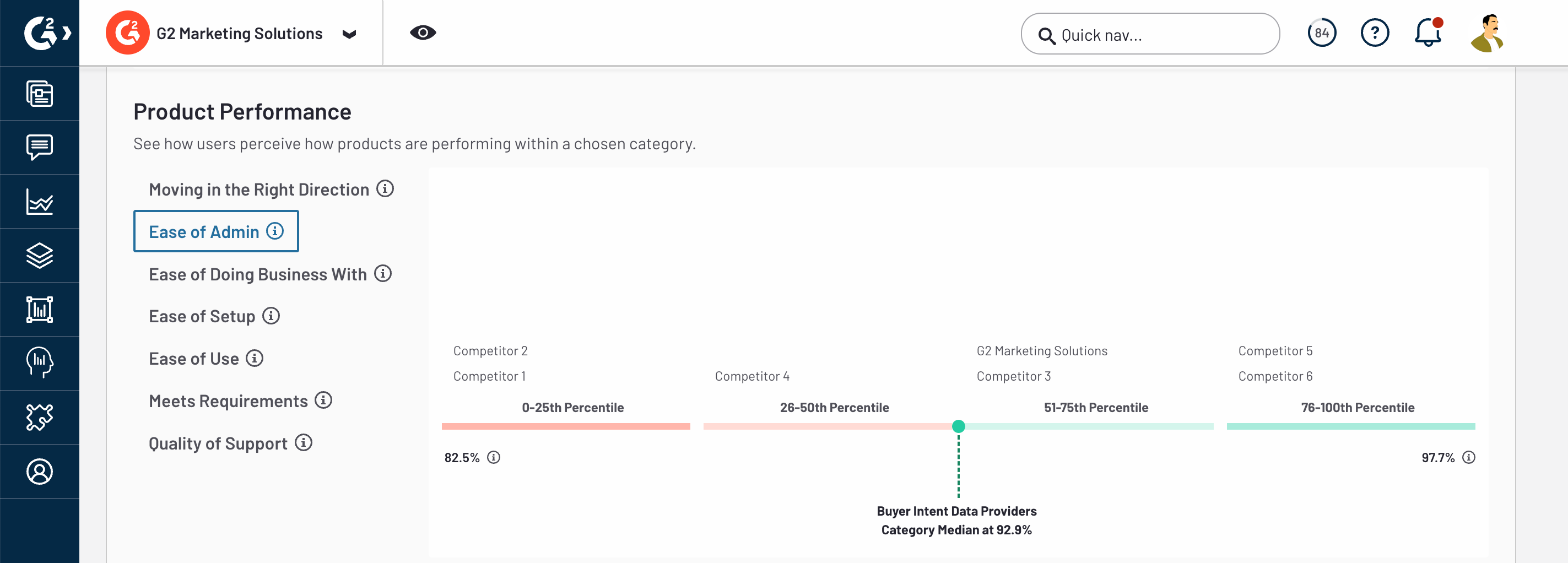
Net Promoter Score and Product Performance
The Net Promoter Score and Product Performance charts plot eight measures of customer sentiment on line graphs.
Hover over a date on the horizontal axis to preview the corresponding chart data, including the average value and the total number of responses, for each product.

G2 represents data points associated with a low number of responses using an open circle.

If a product did not receive any responses for a point in time, G2 connects adjacent points with a dashed line to help you extrapolate trends. For example, the product shown in the following image did not receive any NPS ratings in January or February of 2022.

For more information on filtering and exporting your Satisfaction data, refer to the Filtering Market Intelligence data and Exporting Market Intelligence data sections.
Data sources: Satisfaction
The following table lists each Satisfaction graph, the corresponding question on the review form, and an example use case.
| Graph | G2 review form question | Example use case |
|---|---|---|
| Product Users’ Likes and Dislikes | Likes: "What do you like best about {your product name}?" Dislikes: "What do you dislike about {your product name}?" |
A high percentage of theme mentions can provide insights into opportunities for improving your product roadmap. |
| Net Promoter Score (NPS) | “How likely is it that you would recommend {your product name} to a friend or colleague?” |
A high score for a competitor product can identify an opportunity to learn from their product strategy. |
| Product moving in the right direction | “Is {your product name} headed in the right direction?” |
A high score for your product can increase confidence in your recent product roadmap decisions. |
| Ease of setup | “Was {your product name} easy to set up and rollout?” |
A low score for your product can identify opportunities to improve implementation steps or supporting documentation. |
| Ease of doing business with | “Has {your product name} been a good partner in doing business?” |
A low score for your product can indicate that your customer success teams are missing opportunities to address customer concerns. |
| Meets requirements | “Does {your product name} meet all of your requirements?” |
A low score for a competitor product can indicate an opportunity to highlight your product’s relative strengths in your marketing campaigns. You should download the review data CSV to investigate the missing requirements. |
| Ease of admin | “Is {your product name} easy to administer?” |
A high score for your product can indicate that your product’s maintenance and deployment process from senior leaders to direct users is intuitive. |
| Ease of use | “Is {your product name} easy to use?” |
A low score for your product can indicate a need to review your UI/UX design. |
| Quality of support | “Is the support team able to answer your questions or support cases quickly and effectively?” | A high score for your product can indicate that your product team has successfully fulfilled their service-level agreement. |
Win Loss
Win Loss reveals trends in market share by using G2 Buyer Intent data to highlight your top competitors and G2 review data to show the competitor products that you’re replacing, and which competitor products are replacing you.

For more information on G2 Buyer Intent signals, refer to the Buyer Intent documentation.
To access Win Loss, go to my.G2, then navigate to Market Intelligence > Win Loss.
Getting started with Win Loss
The Comparisons Made to Your Product panel displays your product's top competitors based on Buyer Intent comparison signals, as well as the corresponding firmographic information for your buyers.

The information in the Comparisons Made to Your Product panel is subject to your filter selections.
Filter options are dynamically populated based on your review data, and you can only filter Buyer Intent data based on your review data. For example, if your product does not have any reviews from Small Business users, you will not be able to filter Buyer Intent comparisons from Small Business buyers.
The High Level Win Loss panel presents a snapshot of your churn data using pie charts.

G2 automatically populates your Win Loss graphs with every competitor product mentioned in the corresponding G2 review questions.
G2 assigns each of your top 10 competitors to a color-coded segment. Data for competitors not in the top 10 are aggregated into an Other segment. You can access the products included in Other by exporting your chart or review data to a CSV.
Each segment represents a competitor, and is labeled with the corresponding percent of responses. Hover over a percentage to show the name of the competitor and the total number of responses.

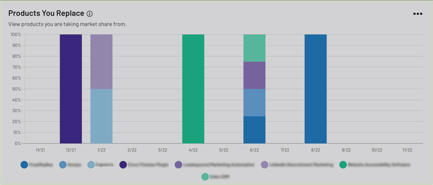
To further analyze changes to your market share over time, use the Products Replacing You and Products You Replace stacked bar graphs.

Each segment represents a competitor product. Hover over a segment to preview the corresponding chart data, including the competitor product, the percent of total responses, and the total number of responses.

You can add or remove competitors from your stacked graphs by selecting their name from the key.
G2 also includes replacement metrics per industry and market segment.

For more information on filtering and exporting your Win Loss data, refer to the Filtering Market Intelligence data and Exporting Market Intelligence data sections.
Win Loss Summary
The Win Loss Summary panel uses AI-generated insights to provide a high-level overview of your competitive performance, highlighting top competitors your product is compared to, and which products you are losing to or gaining share from during the selected timeframe.

G2 dynamically creates unique, natural-language summaries from reviews matching your selected date range, competitors, and other filter criteria. AI-generated insights are refreshed daily.
You should use AI-generated insights as a starting point for deeper analysis of Win Loss data.
Switching themes
The Switching Themes From Reviews panel highlights common reasons for customer churn by analyzing review response text.

Themes for both customers who switch to your product and switch away from your product are displayed under the corresponding Products You Replace and Products Replacing You graphs.
The top three themes are shown by default. To access a full list of themes, select See Details.

For each theme, G2 reports a snippet from the most recent review associated with the theme. To access the last 10 reviews associated with a theme, select See Details.

Select Read Review to access the full review response on G2.com.

You can also access your themes and the corresponding review responses from the review data CSV export.

For more information on exporting review data to a CSV, refer to the Exporting Market Intelligence data section.
Data sources: Win Loss
The following table lists each Win Loss graph and the corresponding question on the review form.
| Graph | G2 review form question |
|---|---|
| Products You’re Replacing | “What did you switch from?" Competitor names are sourced from responses to the “What did you switch from?” question on your product’s G2 review form. |
| Products Replacing You | “What did you switch from?” Competitor names are sourced from responses to the “What did you switch from?” question on your competitors’ review forms. |
| Switching Themes From Reviews | "Reason for switching” Responses to the "Reason for switching" prompt on your and your competitors’ review forms are analyzed and sorted into themes. |
Pricing and Contracting
Pricing and Contracting reveals how customers feel about your product’s price point and helps you understand how your competitors discount and sell their products.

To access Pricing and Contracting, go to my.G2, then navigate to Market Intelligence > Pricing and Contracting.
Getting started with Pricing and Contracting
To get started, search for and select up to five of your competitors using the Competitors dropdown.
By default, G2 populates the Competitors dropdown with the top five products in your main category. You can modify your list of competitors to include any product in a shared product category.
G2 plots your Pricing and Contracting data on line graphs and assigns each of your competitors a unique color to help you visualize trends.

Hover over a date on the horizontal axis to preview the corresponding chart data, including the average value and the total number of responses, for each product.
G2 represents data points associated with a low number of responses using an open circle.
If a product did not receive any responses for a point in time, G2 connects adjacent points with a dashed line to help you extrapolate trends. For example, the product shown in the following image did not receive any Perceived Cost ratings in June of 2022.

For more information on filtering and exporting your Pricing and Contracting data, refer to the Filtering Market Intelligence data and Exporting Market Intelligence data sections.
Pricing and Contracting Summary
The Pricing and Contracting Summary panel uses AI-generated insights to help you understand how your product's pricing and contracting terms are perceived within your competitive landscape.This includes highlighting areas where your product excels and identifying opportunities for improvement.

G2 dynamically creates unique, natural-language summaries from reviews matching your selected date range, competitors, and other filter criteria. AI-generated insights are refreshed daily.
You should use AI-generated insights as a starting point for deeper analysis of Pricing and Contracting data.
Data sources: Pricing and Contracting
The following table lists each Pricing and Contracting graph and the corresponding question on the review form.
| Graph | G2 review form question |
|---|---|
| Perceived Cost | “Is this product expensive?” |
| Average Discount Given | “What percent discount did you receive?” |
| Average Contract Length | “What is the term of your contract?” |
On the G2 review form, reviewers are asked to select their discount and contract length from a list of preset ranges.

To simplify data analysis, G2 converts each range to a single average value. For example, if a user selects a discount of “11-20%”, G2 uses 15% in your chart data.